MusicMaster Blog
“U Got the Look” Customizing MusicMaster posted on October 27th, 2023
By Dave Tyler
I am sure you’ve noticed that just about everything these days is customizable to your preferences. MusicMaster is no different. Some of us spend many hours a week in front of our computers using MusicMaster, so wouldn’t it be great if you could make it look just how you wan it to? Well…YOU CAN!
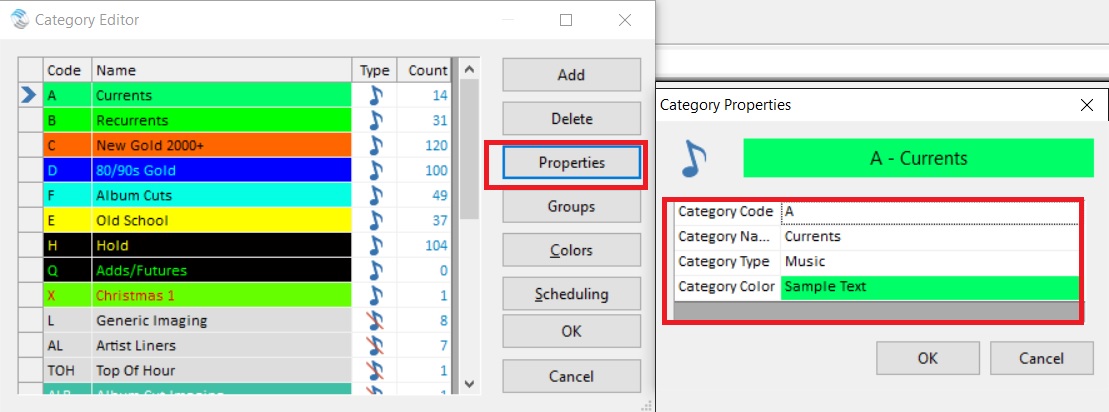
Of course you can color and style your categories by going to Dataset/Library/Categories and then choosing the Properties button.
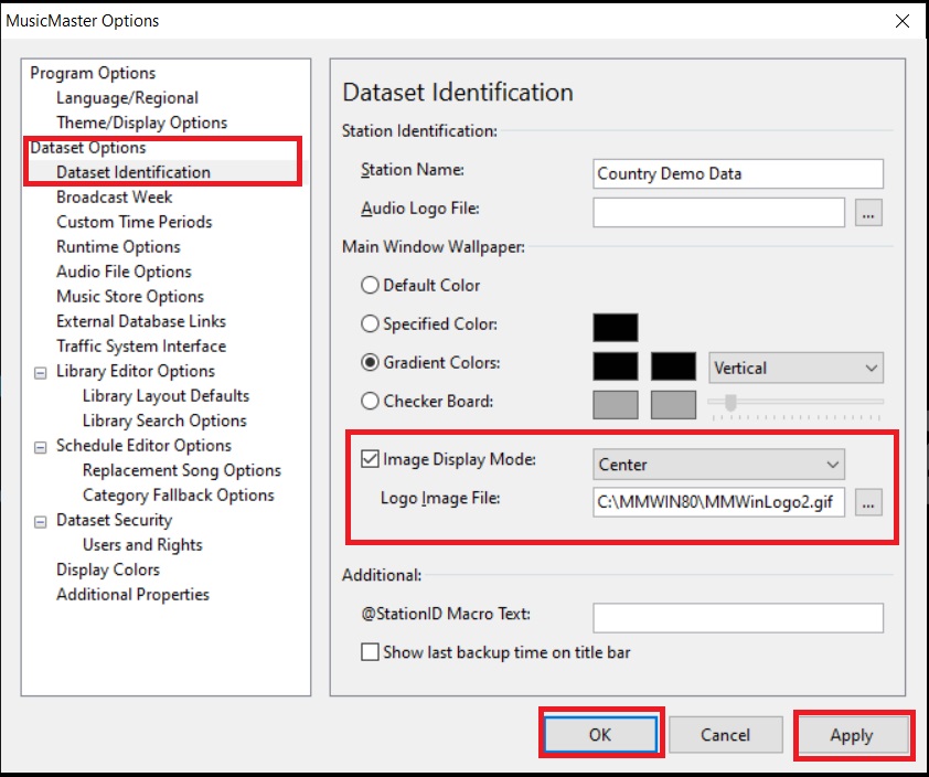
You can even add your favorite picture or station logo to the background of the main window by going to Tools/Options/Dataset Identification.
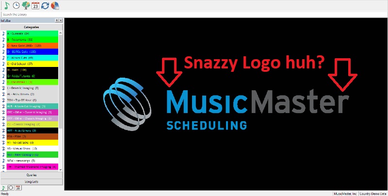
And just like that my sweet looking logo is right there!
But wait, there is even more ability to customize in the Tools/Options area. See where it says Theme/Display Options? That’s the spot.
The title of this blog was inspired by the Prince song of the same name, so let’s dig in to some of the cool premade themes the MusicMaster team already has ready for you to use. Let’s start with “Purple Rain”….pretty cool don’t ya think?
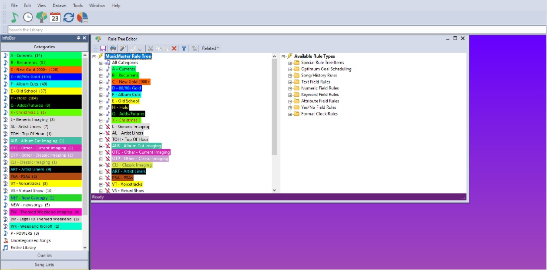
I think it is pretty cool that there are several premade themes for you here to explore and play with.
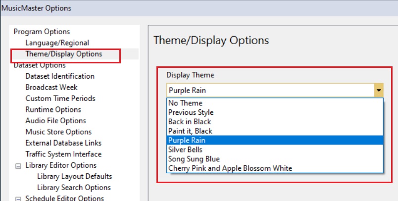
For those of us that like simple, then you can choose No Theme. Or if you recently updated to version 8 from let’s say version 6 you might prefer the old style of icons you had in 6. Selecting “Previous Style” will get it back to that look for you.
We’re in radio…. This is supposed to be fun right? I love it when I am helping a client and I see that they have totally made the program to look the way they want to see it. I have seen some crazy color schemes, etc. We spend a great part of our lives working and cultivating the sounds of our radio stations. Enjoy it….your way!

