MusicMaster Blog
Customizing MusicMaster posted on February 27th, 2012
by Marianne Burkett
When you start using MusicMaster after having worked with other scheduling software, you may or may not be aware of all the choices you have about colors, layout, font sizes and embedding your logo into the software. Yes, all things are possible and it’s very fun to play at setting it up.
Typically, your assigned Music Scheduling Consultant or former Program Director or Music Director had these options set up the way they designed it for themselves or for you. In the years I’ve worked as a consultant with MusicMaster – I have seen many different styles. Bold and colorful, gray scale, the old-school DOS look…etc. It’s very personal and can be an outlet for your creativity.
Let’s begin with your Dataset Identification… It’s what you see at the top of your screen when opening the database. It’s also what you’ll probably use in your paper log, so have fun with it!
Go to Tools/Options. From there you’ll see Dataset Identification.
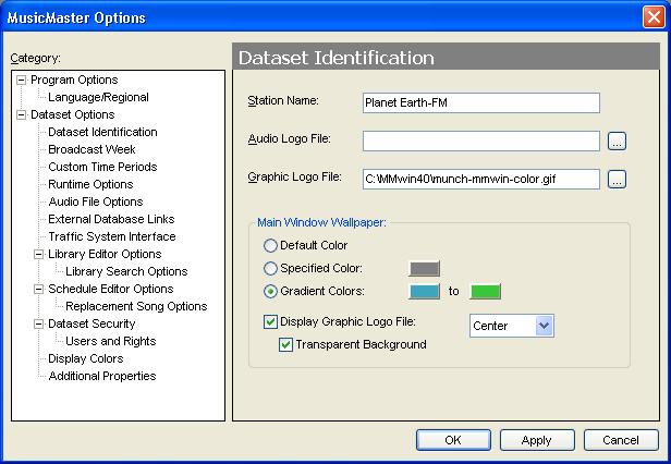
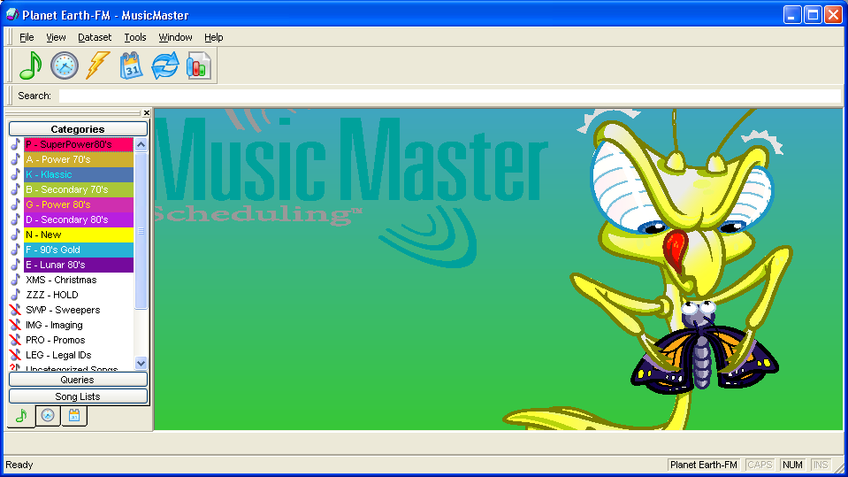
Click OK and you’ll see how your Gradient colors and Logo GIF or JPG look together:
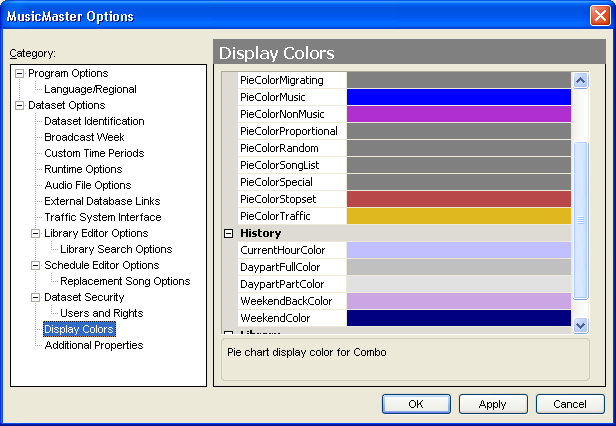
You can also customize your Display Colors in Tools/Options, which can make your clocks come alive.
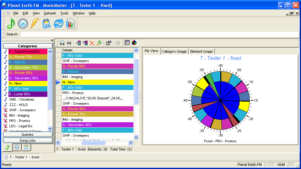 Coloring, re-coloring or renaming a category is quite simple as well. Just go to your Info Bar. In the illustration above, the “Info Bar” is on the left with the list of categories. Right click on any category and go to the Category Properties and make your changes.
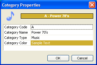
When you change a Category Code in Category Properties, it changes the category codes in your clocks immediately.
Right clicking on the Info Bar will also show you a list of options to choose from for customizing the order in which your categories are shown on the Info Bar and in your Rule Tree. Right click on any category and then select “Category Editor”, put your cursor on the blue arrow… hold down and drag the category up or down the list.
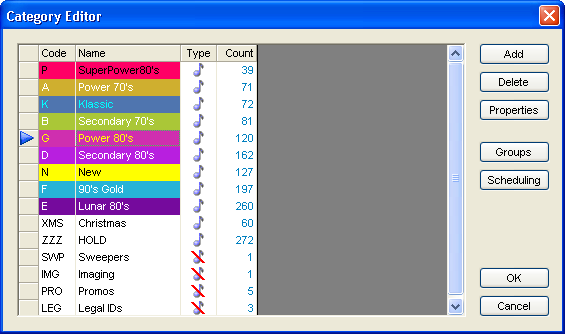
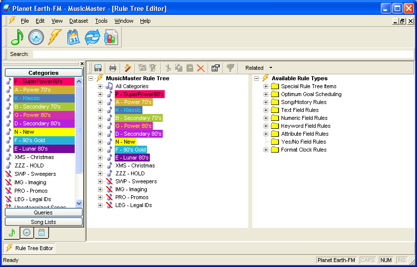
When you’re done, click OK and the changes are immediate on the Info Bar and in the Rule Tree:
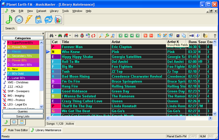
Now, for the fun stuff. Library Viewing and Schedule Editor Views: In Library Maintenance click on the little icon that looks like a pencil. That’s your Show/Hide Fields icon where you can edit your grid.
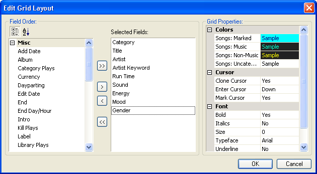
Make your changes until you find colors that are pleasing to YOUR eye. Save your design.
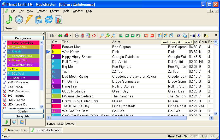
You can have many views, so if your VP of Programming or Consultant are color blind or picky, you can set them up with something a little more conservative, like this:
Now that you’ve got your library views all set, let’s go to where you probably spend most of your time, the Schedule Editor. Again, if it’s set up already it could be simple, like so:
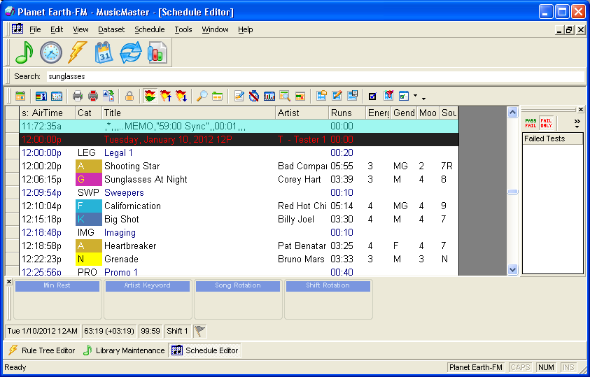
Or a bit more vibrant by using color and Schedule Highlights rather than basic coding in the view:
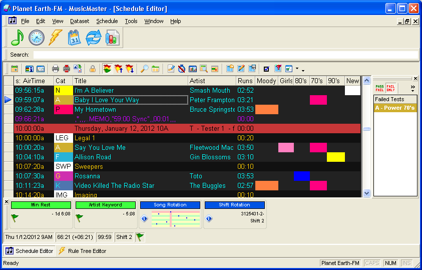 The Schedule Highlights allow you to choose a color for things you want to separate without having to focus on a particular Letter or Number. It makes editing a breeze! Click on the highlighter icon.
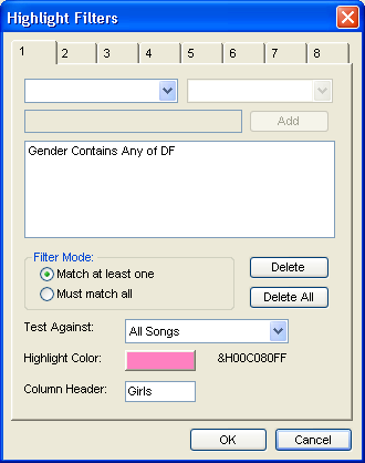
You can create up to eight different highlight colors. In the example I’ve selected Gender Female and Duet and given the highlight a pink color:
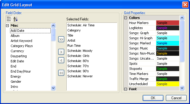
After you’re done setting the highlights up, you’ll need to drag your highlights into the Selected fields in your edit grid layout and hit okay. Then you can size them and Save.
 I could keep going and going and going with more customization features in MusicMaster. Check them out and find the look that’s right for you! As always, if you need help with any of our blog topics, contact your Music Scheduling Consultant!

